What is PCA?
Inspecting a dataset to uncover key insights and trends is necessary before undertaking any economic analysis. We can easily visualise complex patterns and relationships across a dataset using an analytical method called Principal Component Analysis (PCA).
PCA calculates principal components (PCs) of a dataset. A PC is a linear combination of the features (the variables in the dataset). There are an infinite number of combinations of the features; the first PC (PC1) is the linear combination that maximizes the amount of information across the dataset that can be captured in one linear combination of the features. Subsequent PCs are then the linear combinations of the features that capture the most remaining information not already captured by the previous PCs.
We can plot the PCs on a graph to visualise much of this information.
The dataset
We have created a dataset of cellphone handset prices using listings from an online marketplace. We have combined the listings dataset with a dataset of technical information for each handset. The dataset includes listing information on prices, handset model, headline hardware specifications, and handset condition (‘New’, ‘Openbox’, ‘Refurbished’); as well as technical information on key components including the screen, camera, battery, processor, memory, and 5G connectivity.
This dataset includes 249 listings consisting of 64 distinct handsets released between 2016 and 2022. Handset OEMs include Apple, Samsung, Google and Motorola. Sales prices range from $93 to $2,270.
Reading a PCA plot
By plotting PCs on the axes of a graph, ,we can visualise much of the information in a dataset using two sets of information:
- A scatterplot of the PCs values for each observation; and
- The weightings used for each feature to create the PCs in the linear combinations (called ‘loadings’).
Figure 1 shows the PCA biplot where the axes plot the first two PCs. The scatterplot shows the values of PC1 and PC2 for each of the listings in the dataset. The vectors (lines from the origin) plot the weightings for each feature (called loading vectors). For example, a weighting of around 0.2 is used for ‘Processing speed’ to calculate PC1 and around 0.5 for PC2.
Figure 1
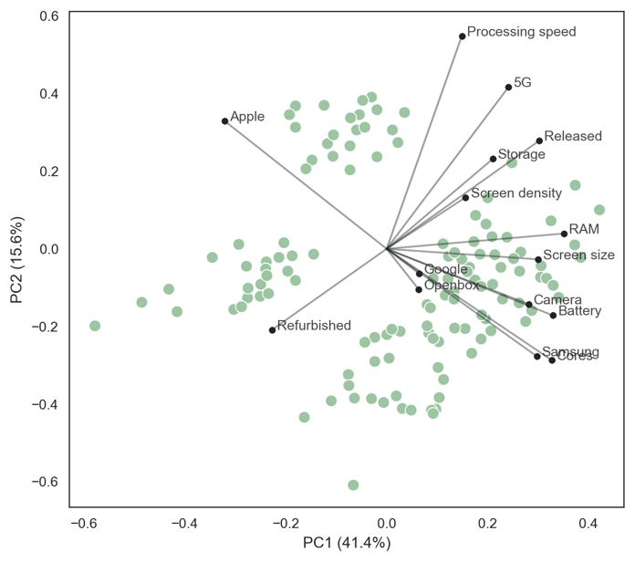
The positions of the loading vectors relative to other vectors indicate correlations between the features. Vectors that are aligned imply high positive correlation between the features, vectors in opposing directions imply high negative correlation, and orthogonal vectors (right-angles) imply no correlation between the features. For example,
- vectors for “Apple” and “Samsung” devices are in opposite directions, which describes a highly negative correlation. This is because most of the dataset contains either Samsung or Apple devices;
- vectors for “Samsung” and “Cores” (the number of processing cores in the device) are almost perfectly aligned, describing a very high correlation. Android devices typically use 8-core processors, while Apple devices use 6-core processors leading to an almost perfect correlation between the number of processing cores and brand (operating system). Another very high correlation is camera megapixels and battery size; and
- vectors for 5G and Apple/ Samsung are almost orthogonal, describing that there is little correlation between 5G-connectivity and these brands. The dataset has a broadly equal proportion of 5G-enabled Apple and Samsung devices.
The length of a vector describes how important it is to the PCs. For example, screen density is less important than storage capacity or release date for these PCs. This can be due to relatively little variation across the less important feature or because of greater randomness in this feature relative to the others.
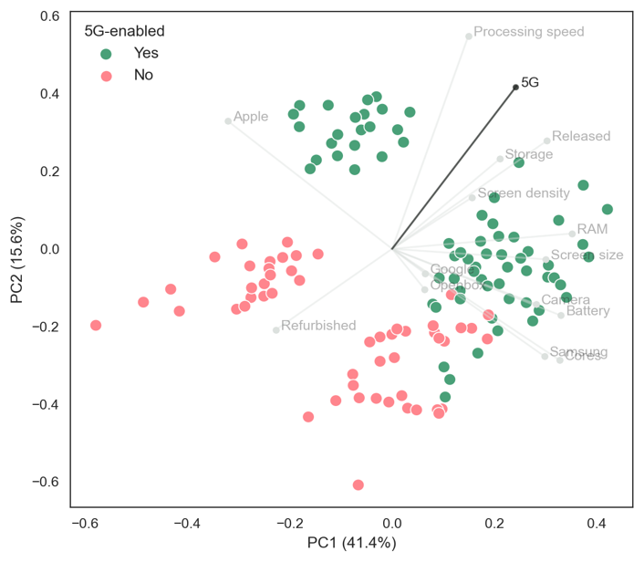
For the scatterplot, the relative positions not the values are important. Overlaying feature values on the scatterplot reveal these loading vector trends. For example, Figure 2 shows which listings are Apple or Android devices and Figure 3 shows which listings are 5G-enabled devices. Apple devices are found towards the upper-left side and Android devices towards the lower-right side while 5G-enabled devices are found towards the upper-right side.
Figure 2
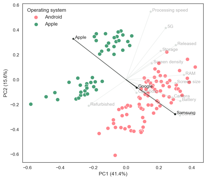
Figure 3
Overlaying features with continuous values highlight further subtle relationships in the dataset. Figure 4 and Figure 5 show processing speeds and RAM, respectively. The highest processing speeds are found in Apple devices, while the largest RAM capacities are often found in Android devices (this is a known difference in the technical architectures between Apple’s iOS and Android).
Figure 4
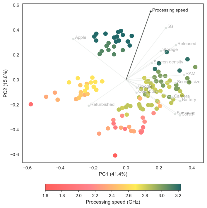
Figure 5
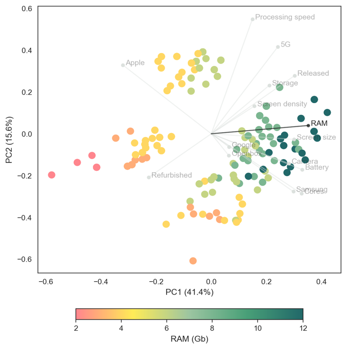
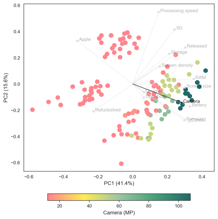
Figure 6 plots primary camera megapixels. This highlights a lesser-known fact that Apple have used 12-megapixel cameras for many generations of the iPhone. While Android phone cameras can range significantly between 12 to 108 megapixels. Interestingly, consumers often cite camera ‘quality’ as a key factor for choosing a handset. It turns out that megapixels are relatively unimportant for image quality beyond 12MP. Instead sensor quality and (in particular) software have been the focus of most refinement and progression for image quality. Higher MP cameras also require greater RAM and storage to process and hold high resolution images.
Figure 6
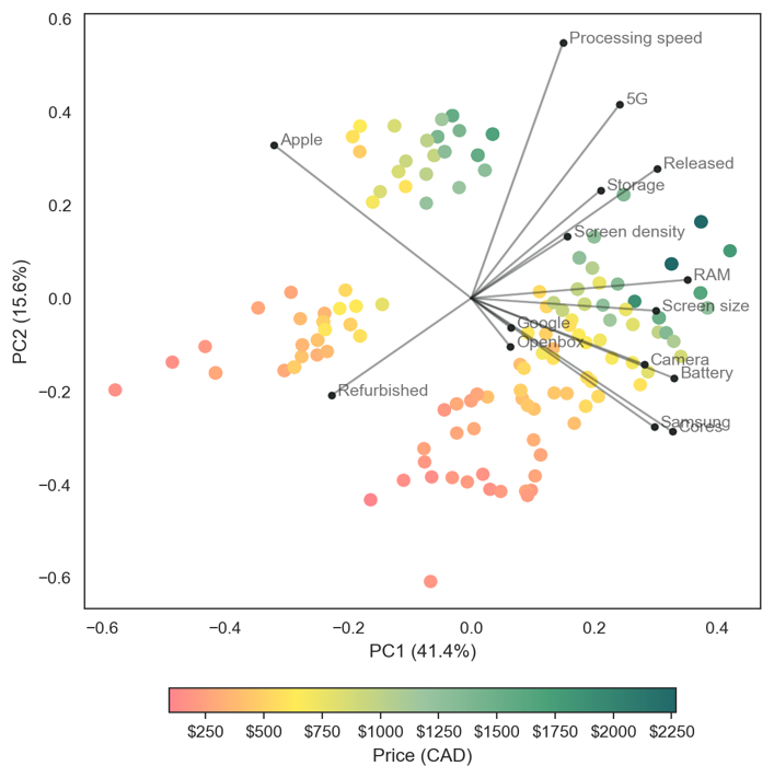
PCA was run on on the features dataset, which does not include sales prices (the target variable of our economic analysis). However, we can overlay the target variable onto the scatterplot to observe trends between the features and prices. Figure 7 plots listing prices. It reveals a strong trend with higher prices towards the upper-right corner. Prices are highly correlated with features such as processing speed, 5G, storage, and release date; and less sensitive to features such as screen size, camera megapixels and battery size.
Figure 7
This analysis informs our economic analysis of sales prices, which will be outlined in our next post.